To photograph artwork well, use even light, a stable camera position, accurate color, a clean background, and files sized for each use. The goal is not to make the artwork look more dramatic than it is. It is to represent it clearly and honestly.
TL;DR: Photograph flat work straight-on, control reflections, include detail shots when useful, edit for accuracy, and export separate versions for applications, portfolio pages, and sales listings.
Start With the Purpose of the Image
Not every artwork photo has the same job. A grant application may need a clean documentary image. A portfolio may need consistency across a series. A sales page may need one main image plus details that show texture, scale, and condition. Before setting up lights, write down where the image will be used and what the viewer needs to know.
Application reviewers often move quickly, so clarity matters more than mood. Buyers may want to understand surface, edges, framing, and scale. Portfolio viewers need to compare work across pieces without being distracted by uneven lighting or shifting backgrounds. A practical guide such as Artwork Archive’s step-by-step guide to photographing artwork can help artists organize the basics before investing in professional gear.
Prepare the Artwork and Space
Clean the area first. Dust, fingerprints, crooked frames, wrinkled paper, and cluttered backgrounds become more obvious in photographs. For flat art, hang or place the work so it is level. For three-dimensional pieces, choose a simple background that separates the object from the wall or surface. Avoid bright colored surroundings that can reflect onto the art.
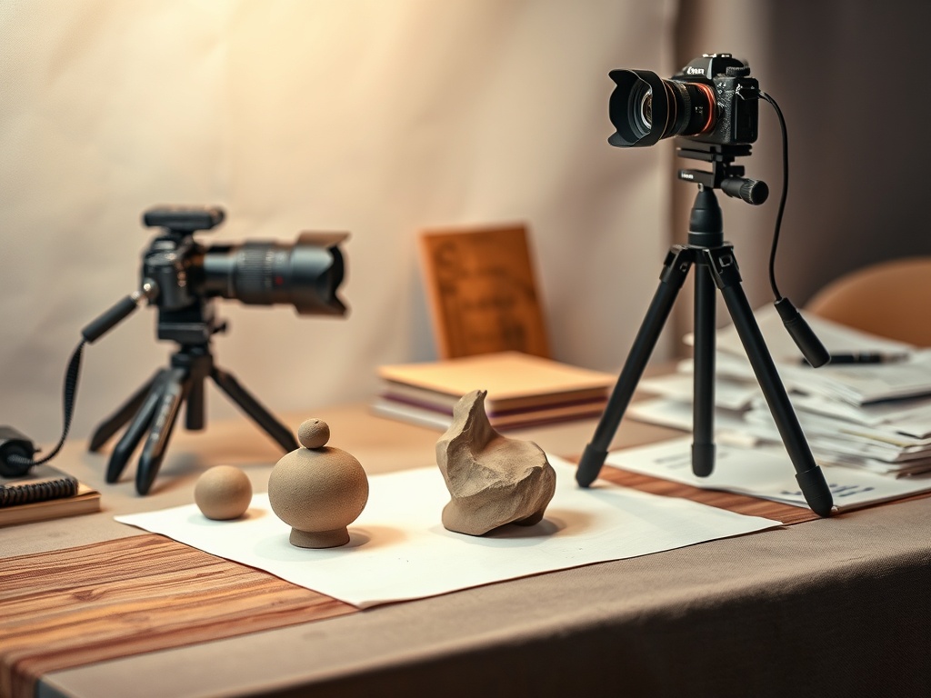
Use a tripod if possible. If you are using a phone, stabilize it on a stand rather than holding it by hand. Place the camera parallel to flat artwork to avoid distortion. For paintings or drawings, the center of the lens should line up with the center of the work. Step back and zoom slightly if wide-angle distortion makes the edges bend.
Lighting Choices for Different Art Types
| Artwork type | Lighting approach | Extra caution |
|---|---|---|
| Painting or drawing | Two even lights or soft window light from both sides | Watch for glare and color shift |
| Glossy or framed work | Indirect light and angle adjustment | Reflections may show the room |
| Sculpture | One main soft light plus fill | Shadows should reveal form, not hide it |
| Textile or relief | Side light with control | Texture can look exaggerated if too harsh |
The National Gallery of Art’s photography collection page is a useful reminder that photography is itself an interpretive medium. For documentation, however, interpretation should be controlled. Do not use heavy filters, dramatic shadows, or saturation that makes the piece look unlike the original.
Shoot the Core Set
For each artwork, capture a main image, a straight detail image, and a scale or installation image when relevant. The main image should show the whole work. The detail image should show surface, brushwork, stitching, paper texture, or material. The scale image should help viewers understand size, but do not use a person unless the platform allows it and the person is non-distracting.
Take more images than you think you need, but do not create endless variations. A practical set might be ten frames per artwork: five main attempts, three details, and two scale or angle shots. Review them on a larger screen before putting the setup away.
If the artwork is part of a broader creative practice, the image set becomes part of your documentation habit. Artists who also work in narrative media may benefit from the consistency mindset used when creating a character sheet for comics, animation, and games.
Edit for Accuracy, Not Drama
Editing should correct exposure, white balance, crop, and lens distortion. It should not change the artwork’s color palette or hide condition issues. Compare the edited image to the physical work in neutral light. If the photo makes a cream background look bright white, or a muted red look neon, keep adjusting.
Crop cleanly and leave a small margin when required by application guidelines. Some juried shows want only the artwork visible. Sales pages may benefit from additional images that show frame, edge, hanging hardware, or texture. Read instructions before exporting.
Export the Right Files
Keep one high-resolution master file and export smaller versions for each use. Name files clearly with artist name, title, year, and view type. Avoid names like IMG_4821 because they create confusion later. Check whether the application requests JPEG, PNG, file-size limits, color space, or exact dimensions.
For sales pages, compress images enough for fast loading but not so much that texture breaks apart. For portfolios, consistency across the grid matters. Use the same background, crop style, and color accuracy across related works.
Common Mistakes That Hurt Results
The biggest mistake is uneven light. One bright side and one dull side can make a flat painting look warped or poorly made. The second mistake is camera tilt. Even a small angle can turn a rectangle into a trapezoid. The third mistake is overediting. A sales image that looks better than the original can create trust problems.
Another common mistake is skipping detail shots. Texture, scale, and materials often matter for applications and buyers. If your work is small, layered, reflective, stitched, carved, or framed, details are not optional. They answer questions the main image cannot.
When DIY Works and When to Hire Help
DIY works for many artists if the work is not highly reflective, extremely large, or needed for high-stakes reproduction. Hire a professional when the work is glossy, metallic, very textured, unusually shaped, or intended for prints, catalogues, museum submissions, or major sales pages. Professional photography can also save time when you need a consistent archive of many pieces.
A good result is accurate, sharp, evenly lit, and useful in context. The viewer should notice the artwork, not the photography setup.
Keep a Repeatable Documentation Setup
Once you find a setup that works, document it. Write down the light source, distance from the artwork, camera height, lens or phone setting, background, and export size. Take a quick behind-the-scenes reference photo for yourself. This record saves time when you need to photograph a new series months later. Consistency also helps reviewers compare pieces fairly because changes in color, crop, and scale do not distract from the artwork itself.